Introduction.
As a broke Lagosian struggling to make ends meet, I constantly juggled bills and expenses, often falling short before the month’s end. One day, while scrolling through Instagram for distraction, I stumbled upon an ad for Branch, a fintech company offering loans and payment services.
The ad caught my attention with promises of quick funds and a straightforward application process. Intrigued by the possibility of accessing immediate financial support, I decided to try it.
Downloading the Branch app was easy, and I was relieved to find a simple interface that guided me through the loan application process.
As a broke Lagosian with limited options, I hoped that Branch could provide the financial relief I desperately needed.To my surprise, my loan application was approved swiftly, and the funds were deposited into my bank account within minutes. It was a moment of relief and gratitude, knowing I could now cover my pending bills and essential expenses.
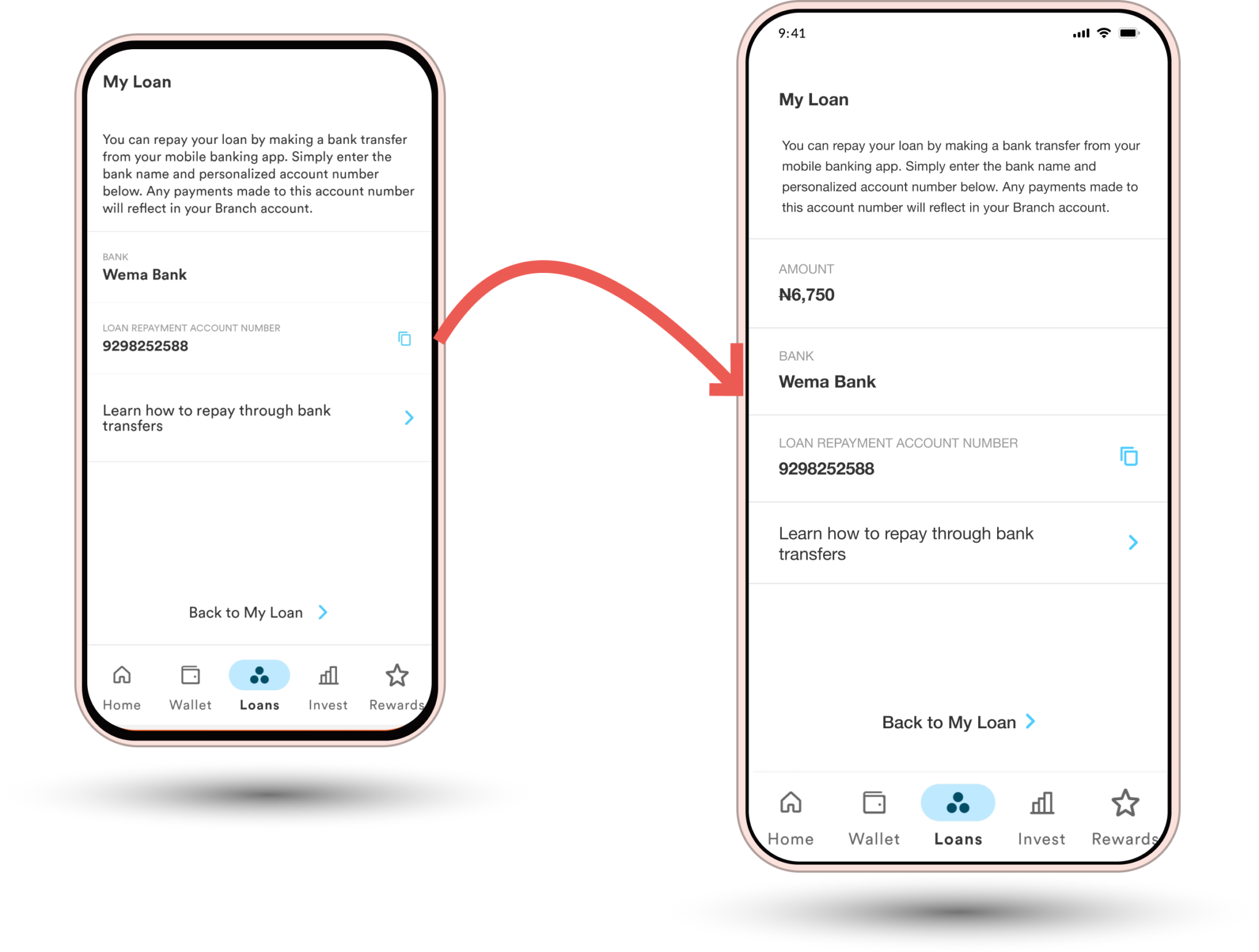
However, my relief was short-lived when the repayment due date approached. Unfortunately, the repayment process was not as seamless as I had hoped. The app’s payment screen displayed only the account details for the repayment, omitting the crucial information about the repayment amount. As a result, I had to navigate back and forth, double-checking the amount I needed to repay.
Feeling frustrated and slightly anxious, I had to backtrack to previous screens multiple times to confirm the repayment amount. A small but significant pain point detracted from my otherwise positive experience with Branch.
Looking back, while the Branch ads had initially caught my attention and led me to a valuable financial resource, they didn’t fully prepare me for the challenges I faced during repayment. It was a learning experience highlighting the importance of user-friendly interfaces in fintech platforms like Branch.
Identifying The Problems.
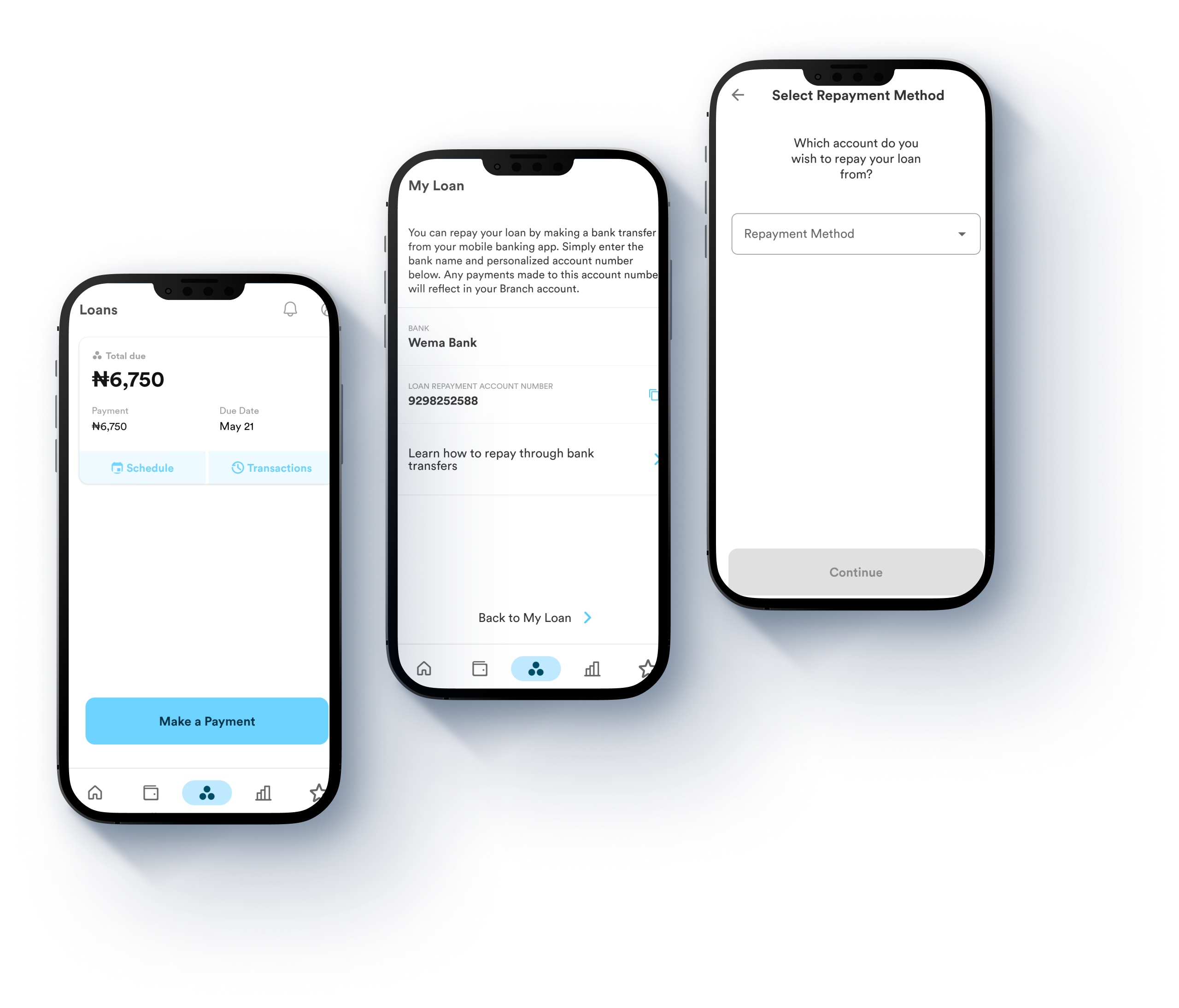
1. Unclear Repayment Amounts: The main problem highlighted is that the Branch app’s payment display screens do not clearly show the repayment amount alongside the account details. This lack of clarity requires users to navigate back and forth to verify the amount they need to repay, leading to frustration and inconvenience.
2. User Frustration: Users experience frustration and anxiety due to the uncertainty caused by the unclear repayment amounts. This can make them anxious about accidentally paying more or less than required, impacting their confidence in using the app for financial transactions.
3. User Interface Issues: The content suggests that the current user interface of the Branch app’s repayment process is not user-friendly, hindering a smooth and hassle-free experience for borrowers.
The Idea.
The idea behind enhancing clarity in displaying repayment amounts within the Branch user experience is to eliminate confusion and uncertainty for borrowers. By ensuring that repayment amounts are clearly visible and prominently displayed, users can make informed decisions and proceed with their transactions confidently. This improvement not only reduces user frustration but also contributes to a smoother and more efficient repayment process, ultimately enhancing overall satisfaction and trust in Branch’s services.

Solution.
The solution offers a comprehensive redesign of the Branch app aimed at significantly improving the user experience. The key feature of this redesign is that it enhanced clarity in the repayment process. There is a clear display of repayment amounts on the payment screen, ensuring users have all necessary information in one place without the need to navigate back and forth.